Introduction
Order the same burger from the same national chain in Chicago and in Phoenix on the same afternoon, and you will not pay the same price. The chain has not changed. The recipe has not changed. The platform has not changed. Yet the number on the screen is different — and across fifty US metros, the spread on a single flagship item routinely exceeds $2.40.
That gap is not an accident, and it is not inflation. It is the visible surface of a pricing architecture that almost nobody outside the platforms themselves can see: a layered system of menu markups, city-level operating costs, promotional intensity, competitive density and commission structures, all of which vary by geography and none of which are published.
For restaurant chains, CPG brands, delivery platforms and investors, that invisibility is expensive. A chain cannot enforce brand price consistency it cannot observe. A challenger platform cannot undercut a rival whose real prices it does not know. An investor cannot model take rates from a national average that describes no actual transaction.
DoorDash Pricing Data Scraping makes the architecture visible. At FoodDataScrape, we crawl 220M+ pages of food data every week, extracting menu and pricing data across DoorDash, Uber Eats, Grubhub and regional platforms at metro and ZIP-code granularity. This article breaks down why prices diverge geographically, what the data actually shows, and how the organisations that see it use it.
The Four Layers of a Delivery Price
The number a consumer sees is a stack, not a price. Understanding the stack is what turns raw scraped data into intelligence.
Layer 1 — The in-store base price. What the restaurant charges a walk-in customer. This already varies by metro, because rent, wages and local input costs vary. A quick-service restaurant in a high-cost coastal metro has a structurally higher base than the same brand in a lower-cost inland metro.
Layer 2 — The delivery menu markup. Most restaurants list higher prices on delivery platforms than in store, to offset platform commission. The markup is not fixed. Some operators apply a flat percentage, some apply it selectively to high-margin items, and some do not mark up at all. The variance between operators of the same brand in different metros is often larger than the variance between brands.
Layer 3 — Platform fees and surcharges. Service fees, small-order fees, regulatory response fees and delivery fees layer on top. Several US cities have imposed commission caps on delivery platforms, and platforms have responded with city-specific surcharges. This means local regulation is directly and measurably encoded into the checkout price.
Layer 4 — Promotional depth. Discounts, free-delivery thresholds and platform-funded promotions vary by metro based on competitive intensity. A metro where three platforms are fighting for share sees deeper, more frequent discounting than a metro where one platform dominates.
Only Layer 1 is intuitive. Layers 2, 3 and 4 are where the real divergence lives — and all three are publicly observable if you collect them properly.
Why the Same Chain Prices Differently in Different Cities
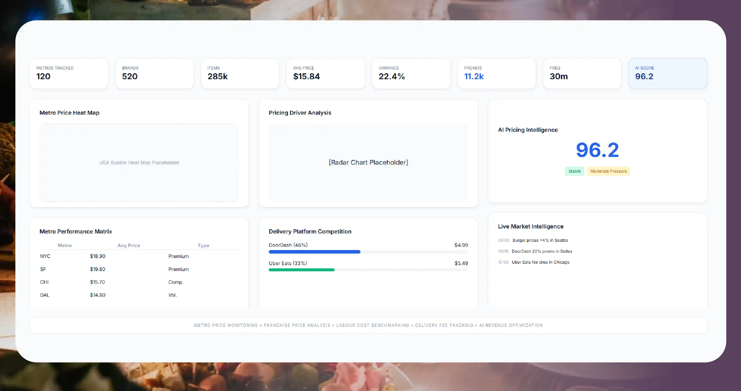
Five forces drive metro-level divergence, and the data confirms each one.
Franchisee autonomy. Most large US chains are franchised. Franchisees frequently control their own delivery menu pricing. The result is that a single brand can carry meaningfully different delivery prices across metros — and sometimes across neighbourhoods within one metro.
Labour cost geography. Minimum wage differs substantially across states and cities. Menu prices track it.
Commission caps and local regulation. Where a city caps the commission a platform may charge, the economics shift, and both restaurant markups and platform fee structures adjust in response.
Competitive density. In metros where DoorDash, Uber Eats and Grubhub all hold meaningful share, promotional pressure compresses effective prices. In metros with a dominant platform, effective prices run higher.
Demand elasticity. Affluent, delivery-native metros absorb higher prices. Price-sensitive markets do not, and operators price accordingly.
The commercial implication is direct: your brand's price perception is being set metro by metro, by people who do not report to your pricing team.
Sample Data: Same Item, Fifty Metros
Below is a representative extract structure for a single flagship item tracked across multiple US metros. Values are illustrative of format and field coverage.
{
  "item_name": "Signature Double Burger",
  "brand": "Example Burger Co.",
  "platform": "DoorDash",
  "tracking_date": "2026-07-13",
  "metro_data": [
    {
      "metro": "San Francisco, CA",
      "zip_sample": "94110",
      "in_store_price_usd": 9.49,
      "delivery_menu_price_usd": 12.29,
      "menu_markup_pct": 29.5,
      "service_fee_usd": 2.15,
      "delivery_fee_usd": 3.99,
      "active_promotion": false,
      "effective_checkout_usd": 18.43
    },
    {
      "metro": "Chicago, IL",
      "zip_sample": "60614",
      "in_store_price_usd": 8.99,
      "delivery_menu_price_usd": 10.89,
      "menu_markup_pct": 21.1,
      "service_fee_usd": 1.85,
      "delivery_fee_usd": 2.99,
      "active_promotion": true,
      "effective_checkout_usd": 15.73
    },
    {
      "metro": "Phoenix, AZ",
      "zip_sample": "85004",
      "in_store_price_usd": 8.29,
      "delivery_menu_price_usd": 9.89,
      "menu_markup_pct": 19.3,
      "service_fee_usd": 1.60,
      "delivery_fee_usd": 2.49,
      "active_promotion": true,
      "effective_checkout_usd": 13.98
    },
    {
      "metro": "Atlanta, GA",
      "zip_sample": "30308",
      "in_store_price_usd": 8.49,
      "delivery_menu_price_usd": 10.19,
      "menu_markup_pct": 20.0,
      "service_fee_usd": 1.75,
      "delivery_fee_usd": 2.79,
      "active_promotion": false,
      "effective_checkout_usd": 14.73
    }
  ]
}
Themenu_markup_pctfield is the one that most surprises chain executives. A 29.5% markup in one metro against 19.3% in another is not a pricing strategy — it is the absence of one. The brand is being priced by whoever happens to be operating the franchise.
Sample Data: The Menu Markup Gap
| Metro | In-Store | Delivery Menu | Markup | Rank by Markup |
|---|---|---|---|---|
| San Francisco, CA | $9.49 | $12.29 | 29.5% | 1 |
| New York, NY | $9.99 | $12.79 | 28.0% | 2 |
| Seattle, WA | $9.29 | $11.69 | 25.8% | 3 |
| Boston, MA | $9.19 | $11.39 | 23.9% | 4 |
| Chicago, IL | $8.99 | $10.89 | 21.1% | 5 |
| Atlanta, GA | $8.49 | $10.19 | 20.0% | 6 |
| Phoenix, AZ | $8.29 | $9.89 | 19.3% | 7 |
| Kansas City, MO | $7.99 | $9.29 | 16.3% | 8 |
The base price spread across these metros is $2.00. After markup, the delivery menu spread is $3.50 — the markup does not merely reflect cost differences, it amplifies them.
For a brand that spends heavily on national advertising promising consistent value, this is a brand integrity problem measurable to the cent.
Sample Data: Cross-Platform Divergence Within One Metro
Metro: Chicago, IL — ZIP 60614 — Same restaurant, same item
| Platform | Menu Price | Service Fee | Delivery Fee | Promotion | Effective Total |
|---|---|---|---|---|---|
| DoorDash | $10.89 | $1.85 | $2.99 | Free delivery over $15 | $15.73 |
| Uber Eats | $11.19 | $2.05 | $1.99 | None | $15.23 |
| Grubhub | $10.49 | $2.40 | $3.49 | $5 off first order | $16.38 |
The platform with the lowest menu price delivers the highest checkout total . Consumers who compare only the item price are systematically misled — and brands that monitor only the item price are measuring the wrong number.
Effective checkout price, not menu price, is the metric that determines whether a customer completes the order.
The Metrics That Actually Predict Revenue
Most delivery pricing programmes measure the menu price and stop. The menu price is the least useful number in the stack. These are the metrics that move outcomes:
Effective Checkout Price. The total a consumer actually pays for a standardised basket, including all fees and promotions. This is the only number that determines conversion, and it is the one almost nobody tracks — because computing it requires simulating the full fee stack across platforms, which cannot be done from menu data alone.
Markup Dispersion. The standard deviation of delivery menu markup across your locations. A tight distribution means a controlled brand. A wide one means your pricing policy exists on paper only.
Price Rank Within Category. Where your item sits against local competitors in the same cuisine and price band, within the same delivery radius. National price positioning is meaningless; a consumer only ever compares against what is deliverable to them right now.
Promotional Exposure. The percentage of days in a period during which a competitor ran an active promotion on a comparable item. A competitor promoting 60% of the time has effectively repriced, and your unpromoted price is being compared against their promoted one.
Fee-to-Food Ratio. Total fees as a percentage of food subtotal. In some metros this exceeds 30%, which changes basket behaviour materially — consumers order less frequently and in larger baskets, which changes which menu items sell.
Price Change Velocity. How often competitors adjust delivery prices. In competitive metros, this is measured in days, not quarters. If you reprice annually and your competitor reprices monthly, you are always responding to a price that no longer exists.
Every one of these is computable from public data. None of them appears in a platform's merchant dashboard.
Who Uses DoorDash Pricing Data — And What They Do With It
Restaurant chains and franchisors Enforce delivery pricing policy across franchisees. Identify outliers where markup is damaging brand price perception. Quantify the revenue impact of markup strategy by metro.
Independent restaurant groups Benchmark markup against local competitors before setting delivery prices, instead of guessing.
Delivery platforms Benchmark competitor menu prices, fee structures and promotional intensity metro by metro to inform market entry and pricing response.
CPG and beverage brands Track how their products are priced when sold through restaurant delivery channels, and identify markup that suppresses trial.
Investors and equity research teams Model platform take rates from observed data rather than disclosed averages. Measure promotional intensity as a proxy for customer-acquisition burn across metros.
Regulators, policy researchers and journalists Quantify the effect of commission caps on consumer prices with actual before-and-after data.
Real estate and site selection teams Use delivery price levels and promotional intensity as demand-side indicators for market attractiveness.
The FoodDataScrape US Delivery Pricing Data Model
- Restaurant identity: business name, brand, chain affiliation, franchise indicator, address, metro, ZIP code, coordinates
- Platform presence: DoorDash, Uber Eats, Grubhub and regional platform listings, listing URLs, active status
- Menu: complete item catalogue, normalised item names, categories, descriptions, modifiers, combos, dietary and allergen tags
- Pricing: delivery menu price, in-store price where publicly published, computed markup percentage, price history
- Fees: service fees, delivery fees, small-order fees, regulatory surcharges, minimum-order thresholds
- Promotions: active offers, discount depth, free-delivery thresholds, promotional duration
- Effective price: computed checkout total for a standardised basket, enabling true cross-platform comparison
- Performance signals: rating, review count, review velocity
- Change tracking: price movements, item additions and removals, promotional starts and stops
Delivered as API, CSV, JSON, Parquet, cloud storage drop or direct BI integration, with daily refresh on pricing fields.
Methodology and Compliance
- We collect publicly accessible menu, pricing and fee information only. No authenticated content, no private data, no personal consumer data.
- Data is collected at ZIP-code granularity , because a metro-level average conceals precisely the intra-metro variance that matters.
- Item names are normalised across platforms and locations , so the same product resolves to one entity regardless of how each listing spells it.
- Effective checkout price is computed on a standardised basket , which is the only methodologically sound way to compare platforms whose fee structures differ.
- Crawlers are rate-limited and designed not to degrade the platforms we collect from.
Measurable Outcomes
| Metric | Without Data | With FoodDataScrape |
|---|---|---|
| Franchise markup compliance visibility | None | Complete, by location |
| Cross-platform effective price comparison | Not possible | Computed daily |
| Competitor price change detection | Anecdotal | Within 24 hours |
| Metro-level pricing strategy | National average | 50+ metros, ZIP-level |
| Promotional intensity benchmarking | Unavailable | Tracked continuously |
| Time to build a national pricing map | Months | Days |
Conclusion
There is no such thing as a national delivery price. There is a price in this ZIP code, on this platform, at this hour, under this promotion, marked up by this franchisee — and it is different from the one two hundred miles away that your marketing promises is the same.
That divergence is not going away. It is widening, as regulation fragments, labour costs diverge and platform competition intensifies metro by metro. The organisations that will price well in this environment are the ones that can actually see it.
DoorDash Pricing Data Scraping is how you see it — daily, at ZIP-code resolution, across every platform that matters.
FoodDataScrape crawls 220M+ pages of food data every week so that your pricing decisions are based on what is actually on the screen, not on what you assume is there.
Questions
Frequently Asked Questions
Coverage extends across the top 50 metros by default, and can be extended to any ZIP code in the country on request.
Yes. Cross-platform comparison within the same ZIP is one of the most requested outputs, because it is the only way to compute true effective price.
Where the restaurant publishes in-store pricing publicly, yes. This markup gap is the single highest-value field for chain and franchisor clients.
Daily on price and promotion fields. Menu structure is refreshed weekly.
Yes. Most clients scope to a defined brand set and competitive set to keep the feed focused.
We collect publicly available commercial pricing information and do not handle personal consumer data.
Get a Free Food Data Sample in 48 Hours.
Tell us your platforms, target markets and required fields — we'll map exactly what's possible with food data scraping, recommend the right approach, and send a working sample so you can verify quality before any commitment.
Request a strategy call
Thanks — our data team will reach out within 48 hours with your sample.